

What are the latest trends and tactics used in content marketing? What’s catching on as a way to provide additional value to clients?
In the first of a series, we look at one of the content formats gaining momentum today: ‘gifographics’, also known as ‘infoGIFs’.
Essentially a mash-up of infographics with an element of animation in GIF form, gifographics can add a new dimension to existing content or provide a way for you to diversify the content you produce. They’re also effective for boosting SEO rankings, better engaging target audiences and driving social sharing.
The best infographics distil complex information into more digestible parts through great visual design. Brands are now looking to expand what infographics can do through animation.
The US-based Content Marketing Institute says Jeca Martinez’s 2012 animated infographic ‘So You Want to Make a Short Animation’ was a defining moment. But gifographics didn’t really take off as a major marketing tool until a couple of years ago, when the huge popularity of infographics prompted creatives to start experimenting with animation.
There are certainly pros and cons to gifographics. They get the message across quickly as they don’t require lengthy explanation. They also make numbers more engaging than static infographics, leave a strong impression due to their relative rarity, and aren’t as difficult to produce as you might think.
Drawbacks include being (slightly) more expensive to produce than static infographics, being harder to get right for SEO, and taking longer to load. In addition, gifographics are a bit daunting for marketers who still have trouble getting static infographics right.
But these concerns shouldn’t put you off: SEO optimisation provider Quicksprout reported this infographic on colours received 23,264 visits (as well as more than 800 Facebook likes and 600 tweets) within three days of going live. In comparison, this excellent infographic on how engines work saw the website receive 350,000 visitors in 30 days.
Of course, there are more sophisticated and interactive infographics – such as this one created for The New York Times to chart the huge number of characters in ‘Game of Thrones’. But, as a starting point to make infographics that bit more engaging without breaking the bank, gifographics fit the bill.
Here are a few more examples to get you inspired:
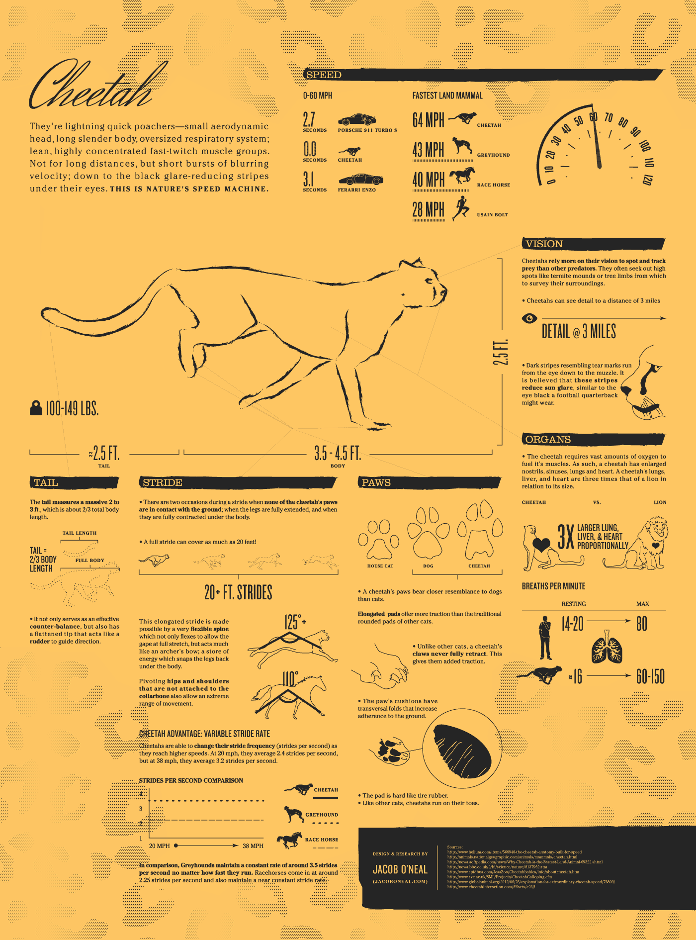
Cheetah gifographic
Baby gifographic
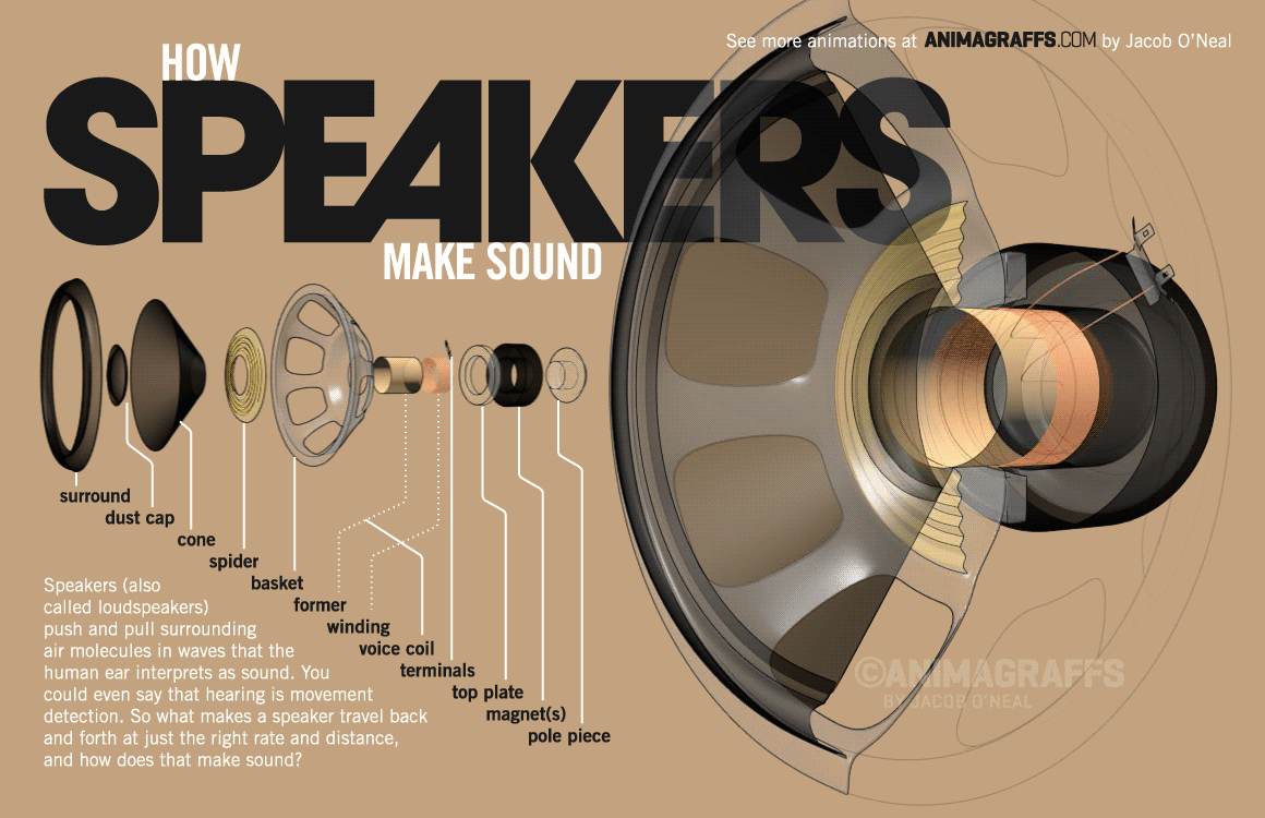
‘How speakers make sound’ gifographic


